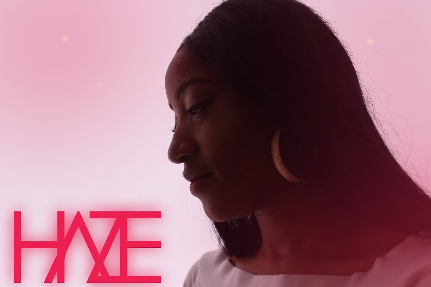


As red lips is our choice of synergy element, I chose to use it as a main aspect of my digipak draft design. I used Adobe Photoshop to bring together these initial designs. I began with the design of the artist's name. Looking at a list of possible name, we chose HAZE, as it was short and memorable, but was also related to our main concept of lights; a hazy environment. I used a simple and thin font, then held down ALT and <- button to adjust the kerning between each letter to make them overlap. I then rasterised the layer and removed the connecting shape in the letter A. I then duplicated the layer and added a gaussian blur effect to the other layer, making the letters glow up as if they were lights - which directly links to our music video. I kept the single name simple and spaced out evenly, then got a picture of lips and used the smudge tool. For the other design, I got a picture of a released smoke bomb (also related to our music video) and adjusted the saturation so it was more of a red tone, as it was initially blue. To create the outline of lips, I used a clip art image and used the magic wand tool to select the outline, and did the same process as I did for the artist font.

No comments:
Post a Comment